Posts in Category: Community Portrait
Meyer
Israel for me starts with Meyer. His is the face I see first when I arrive. For several years now he meets me in Ben Gurion International and takes me home. Meyer is a taxi driver.
I bet you don’t have a private taxi driver, do you? Well, I don’t either, but my parents do. About 10 years ago my parents got into Meyer’s cab by chance, and they liked each other all the way around. And what’s not to like – Meyer has a sunny disposition, amazing energy, a wonderful warm manner and a dickens sense of humor. From that day on my parents rarely called a general taxi line, they call Meyer. And when the airport and the roads got rebuilt and became as complicated as Rubik’s Cube, it became too hard for them to drive to the airport. So Meyer comes and gets me instead. Every year I look forward to seeing him.
9″ x 11.5″ (22 x 29 cm) watercolor on paper
The background
Several people wrote to me via comments here and email asking about the technique for background in this portrait. So I am adding this description. I used splattering technique, I read about it in a couple of watercolor books. I wanted to try it here because I wanted a sense of desert to connect Meyer to his country. Israel is 70% desert, and even though I took this reference in a lush and green little park where my parents live I thought that the connection was called for.
I started with overall light wash of Aureolin (PY40) covering the entire sheet, the face, shirt and BG. Then I put a wash of Yellow Ochre (PY43) covering the BG but also bleeding into skin and hair. I use Daniel Smith colors, and Daniel Smith Yellow Ochre is the most sumptuous Yellow Ochre I have seen. Then I developed the face and shirt almost to completion but not quite. I made a mask for the face and body from a piece of tracing paper and attached it loosely in 3 or 4 places with dots of masking fluid. Having placed the painting horizontally I covered the outer portions of my board with newspaper (you don’t have to do this, I am just anal-retentive like that.) Then the fun began.
I prepared five cups of concentrated paint making it a consistency of heavy cream. I used the same colors as I used in the painting for the skin and shirt in hope to unify the painting and achieve color harmony. I actually put a bit more thought into choosing my BG colors and they were all natural Earths – siennas, umbers and ferrites. I tested my toothbrush and colors on a scrap paper to figure out the size of my droplets and their trajectory. When I liked what I saw on a scrape paper I started on the actual painting. I splattered one color at a time and let colors dry for various times, a little or a lot, without much thought or plan. I wanted to achieve a controlled randomness (now that’s an oxymoron!) Then I checked the tone and decided it was too warm, so I added some Manganese Blue (PB15) splatter, also a natural mineral color and a color from his shirt, which was not in the prepared set of 5. Waited until everything was bone dry and lifted the mask.
I saw that some splatter got onto the face, so I lifted that and cleaned it up. In another small area my mask covered too much and there was a bald spot, so I added spots of needed colors with a brush imitating splatter.
Then I finished the face that needed more punch now that the BG got darker, painted flyaway hair and details on the glasses. Done.
Odelia
I met Odelia in Israel, in Netanya. She served us coffee in our favorite coffee place Shvil HaHalav, the Milky Way. As soon as I saw her I knew I had to paint her – an amazing beauty that she was, exotic and mischievous.
Explaining this to her was a different matter. My Hebrew is very rudimental, and Odelia’s English was not at the level of discussing matters of art. But my mom came to the rescue. With her machine gun Hebrew, taking no prisoners attitude, and general charm – the outcome was guaranteed. I was so lucky to have such an interpreter and advocate of my art. And then I got lucky yet again – the blistering Mediterranean sun gave me a gorgeous play of light and shadow, an opportunity to try chiaroscuro in watercolor.
To say that painting this was difficult would be an understatement. It took nearly 5 weeks, but part of this time I spent in misery, away from my brushes, because I was stuck, didn’t know what to do, contemplated my lack of talent and considering taking on cross-stitching instead of painting. But I wanted to finish more than I wanted to feel sorry for myself, and so I did.
8.5″ x 11.5″ (21.5 x 30 cm) watercolor on paper
Russ
This is Russ. Russ is a massage therapist, and he is a magician. Russ works at the Space Time Tanks center with Eric, and I simply love him. One hour on his table can cause a person to have a different outlook – life is pretty good after all!
I am on the other side of the pond, visiting family in Israel. Everything is great here – sun and flowers and 70 degrees weather, but I haven’t mastered local hardware yet, and so my image is somewhat different from the real portrait. But I want to post it anyway, so you all know that I didn’t fall off the face of the Earth and am still painting and continuing with the Community Portrait series.
11″ x 8.5″ (28 x 22 cm) watercolor on paper
Eric
Eric is a friend of ours. He is also a proprietor of Space Time Tanks, a center for floatation, massage and several other relaxation and self-exploration offerings. New Age is alive and well, at least on 2526 Lincoln Avenue in Chicago. If you haven’t experienced a sensory deprivation tank, you owe it to yourself to try “a vacation in an hour” – you will be a new person without the trials, tribulations and expense of far away travels.
I tried several new things with this portrait. I have resisted stretching paper for a very long time thinking it was not worth the trouble. I was wrong. Stretched with gum tape over Gator board my paper allowed me to use as much water as I wished without warping and buckling and presenting me with a washboard surface just as I am about to work in fine details.
I tried a variegated background. For that I masked the face and hair with Frisket film, sealed it with masking fluid, and went free flying with large brushes, puddles of water, and swirling colors. Loved the freedom of it.
I also tried a different technique for hair, flooding it section by section with my highlight color, then working shadows with my shadow color, then putting in my main color. When all of this was dry I added details, individual hairs and then worked cool and warm tones as the last touch.
I tried to do folds and draping on his black shirt, but this didn’t work all too well. The shirt came out too flat for my liking. I have to think about my fabric draping some more.
8.5” x 11” (21 x 28 cm) watercolor on paper
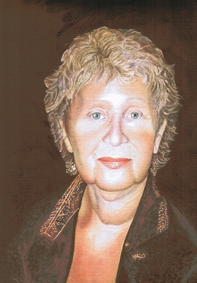
Happy Birthday to my Mom!
Today is my mom’s birthday. Or so we think… We are not a truly dysfunctional family, but we do have our share of quirks. One of them is not knowing for sure on what day my mom was born. All available documentation states February 18th. My grandma, my mom’s mother, insisted that it happened on February 15, and the heck with the records. And she ought to know, she was a major participant in the event. As a result we celebrate twice, and my mother gets twice congratulations, twice phone calls, twice as many cards and flowers, and almost twice as many presents. Personally I think it is a wonderful deal.
Many of my friends and visitors shared with me that they like little snippets of stories that go with my portraits. As I was painting I was trying to think what to write about my mom and finally realized that no matter what I write it would be inadequate. How do you put half a century of love into a blog post? This requires writing on Leo Tolstoy level to do it justice. How do you choose which story of connectedness, care, or mind reading to share? There are too many and they all are special.
Along the same lines this portrait comes short in really showing how beautiful my mom is. I tried…, and I will have to try again.
But what this portrait can do is say – Happy Birthday!
And – I love you, mom!
And – I will see you in two weeks, I can’t wait!
12” x 8.5” (30 x 21.5 cm) watercolor on paper
A big Thank-you goes to my friend Ryan of A Small Town Dad blog for his help with the dark and rich background. I always struggled with achieving a deep saturated background in watercolor. Ryan shared his technique with me without which this sweet chocolate wouldn’t have happened.
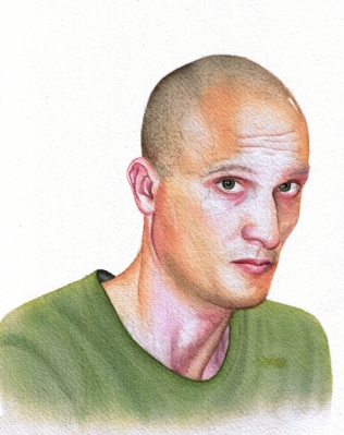
Tim, color study
I am painting again, or trying to… After my 5 months graphite marathon, a.k.a. The Sketchbook Project, I forgot how to paint. This is my second watercolor study of Tim (click the link to see the graphite portrait of him). The first painting study of him was a disaster and I am not posting it. But it is all good and valuable, I am slowly remembering how to handle glazes, a little dry brush, handling and mixing colors. It goes very slowly, I feel as if I am struggling with my hues and values, forcing the media to do what I see in my mind’s eye. This is very different from the free and fluid feeling I had with graphite. By the end of the Sketchbook Project I was simply using the media to render what I wanted, not trying to subdue it into compliance. But I now know about practice, diligence and patience, and what results can be achieved with that. This after all is only the first of a new series I have in mind.
7″x9″ (18 x 23 cm) watercolor on paper


