Posts in Category: watercolor
Psychedelic flower – Take 2
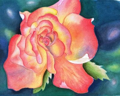
Another take on a pink rose, or Psychedelic flower, as my friend Sam Harrison aptly named it. This time the painting is on Ampersand Aquabord Museum Series Panel, a new painting surface I’ve been trying. Now that the painting is finished I can say that Aquabord with its pebbly clay surface will very likely become my support of choice.
Aquabord takes watercolor like nothing else I tried. It doesn’t bend or buckle, does not need stretching or post-painting straightening. The clay allows for gazillion washes, clearly shows where it is wet so you can’t skip a spot when painting with water, dries to brilliant white or color, and allows lifting and changes of mind with no difficulty. It behaves very much like a Cold Press paper less qualities that I don’t like. It is archival, acid-free and non-yellowing. I understand that it is possible to spray/fix a painting on Aquabord with Krylon finishing spray and frame it without glass. Even better – Ampersand makes Aquabord in a form of a cradle, so work can be displayed without a frame altogether provided sides are finished professionally.
To be objective there were two things I liked less than others. One was that when I wet the clay surface before applying a wash it darkens like wet sand, which makes it somewhat of a guess game what the resulting color will be when it dries. But I soon learned to guess with a great degree of accuracy. And two – it takes more pigment. More pigment than paper that is, but not as much for me to go broke buying more. With this said, in my mind there are not enough negatives to overcome the positives of this beautiful surface. And – No, I do not work for Ampersand!
8″x10″ (20×25 cm) watercolor on Aquabord
Washing a flower
I have been practicing washes in watercolor. I drew a generic flower freehand, so I didn’t have to be concerned with things like anatomical correctness, likeness or too much perspective. The idea was to make two or three washes of different hues meet with a smooth transition at a line or curve of my choosing. Each petal as an individual pool of washes.
I couldn’t do it. My washes were all over the place. I can do a single wash and control it enough for it to end where and how I want. Then when it is dry I can put a second wash of a different hue over it or next to it and control it enough to do the transition. But not two wet washes simultaneously. More practice is needed.
My painting teacher liked this little watercolor, a dear heart that she is, and encouraged me to finish it. I am glad I did because in the process I learned how to deepen my hues with Sepia. Here it is. I am off to practice more washes.
7” x 9” (18 x 24 cm) watercolor on paper
Sly – monochromatic
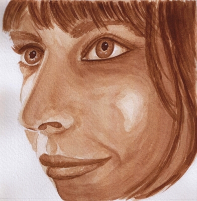
The same face I worked in graphite a few days ago – Sly – now in watercolor, a monochromatic study in preparation for painting a full color portrait. I find her face and expression rather out of the ordinary and complex. Interestingly I have heard quite diverse takes on her expression – sly, crafty, furtive, beautiful, b!tch, bored, boring, playful, coy, cunning, just to name a few. It is very rewarding to me to take in all these different reactions, perhaps it means that I produced a portrait complex and unorthodox enough to cause them.
6″ x 6″ (15 x 15 cm), Burnt Umber on Fabriano Soft Press.
She wears a red bandana
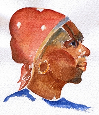
Second quick watercolor sketch from Charles Reid book. This one was harder because first I got in trouble with my drawing and had to start over. Then my pigments wouldn’t give me as dark of a mark as I wanted. So I went over some areas again to build value and it shows.
Another new happening for me – for this sketch I dispensed with my porcelain palette and its individual wells and used a white dinner plate instead. I made dabs of strong pigment and let them mix mud-pie style on my plate. It was great! When I needed sienna-umber 50-50 mix I would pick it up from the middle between the dabs. When I wanted my mix to be more red I moved closer to the center of burnt sienna dab. When I wanted my color tinted I would pull some ultramarine in the center. Very convenient – all color and value gradations where right there on my dinner plate. It took 2 hours to paint her, but it would probably take much longer if I would mixed my colors in the wells each one separate from the other.
5” x 4” (13 x 10 cm) on Arches Cold Press, Cotman pan paints
Saint Nick?
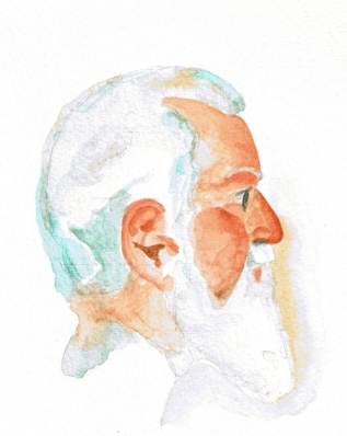
Well, no. I am sure he is not, because he is an exercise from Charles Reid’s book Watercolor Solutions. But he definitely makes me think of St. Nicolas. Must be the beard. I am obsessed with white beards these days because a salt-and-pepper beard from a graphite portrait I am working on is eluding me.
What is astonishing about this sketch is the fact that I painted him in one hour. Including the drawing. Perhaps I do have a little predisposition for portrait after all – an amazing thought! Which is not a thing to say about my painting of water (not shown here because it turned out a disaster.) Or perhaps it is Charles Reid’s technique – 3 super-saturated colors, wet-on-dry, almost dry brush but not quite, no waiting and no smoothing of edges, stop before you think you are finished.
I used my new Escoda 1212 Tajmir Kolinsky brushes, a Hanukkah gift from my parents. Even though I am an adult of respectable age, my dear parents still give me Hanukkah gifts – how wonderful! Well, I painted with them for the first time, and I am here to say: Escoda Kolinsky are a pure bliss!
5” x 6” (13 x 16 cm) on Cotman Watercolor pad, Cotman pan colors.
A bird for my dad
This is a common flicker. It is a small and unpretentious bird with a funny “mustache” and a simple and very chipper song. I wanted have something simple and chipper to greet my dad when he came home from a hospital where he had a little surgery. Something that would make him smile. They say that positive mood is as effective and helpful for recovery as proper medication. So, here’s a little flicker, dad! Hurry up and get well!
6″x8″ (15 x 20 cm) on Fabriano Artistico 300 gsm Soft Press, Cotman pan colors.
Another interesting thing about this painting is the new paper. I tried Fabriano Soft Press for the first time, and I believe myself to be in love. I found my favorite paper! The texture of this paper is somewhere in the middle between Hot Press and Cold Press, retaining the best of both worlds, in my opinion. It is smooth almost like HP and at the same time allows for great color flow, hard crusty edges are not a problem, pigment does not sink into paper valleys, and it is easy to lift color. A real pleasure to paint on. I will do my next portrait on it, should be great for skin.
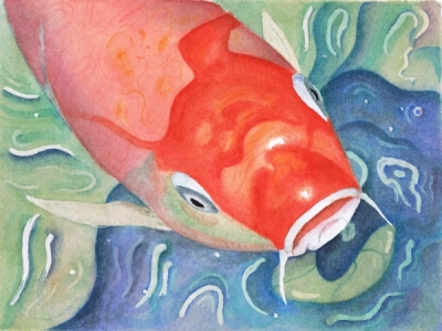
Oh Jonah he lived in de whale
And while it ain’t necessarily so, and this is not a whale but a giant red carp, I still had way too much fun painting it and singing along with Sportin’ Life while doing it.
9”x6” (22×17 cm) on Arches HP, Cotman pan colors.
In other art news, I “met” a wonderful watercolor artist Leslie White of LesliePaints. Unfortunately I only met her in blogosphere, not in person. But she is close enough, the next state over, perhaps one day… In the meantime, enjoy her colors and the way she works light in her paintings. I especially like her nudes.
Never fear!
It is finished. It took a month, dozens of glazes, and I have given up (and resumed) twice in the process.
I’ve been using a traditional glazing technique under instruction of my teacher. There were three hues used – Cobalt Blue, Alizarin Crimson and Cadmium Yellow – single color glazes. I am not sure anymore how many glazes it took, I’ve lost count after 15, the total is probably as many as 25 in some places and as little as 2 in others.
The painting looked amazingly ugly until the very end. And this is why I have given up on it two times. I just didn’t have the heart to continue and be faced with my inadequacy. Interestingly I have been reading Art & Fear: Observations on the Perils (and Rewards) of Artmaking by David Bayles and Ted Orland while I was struggling with the glazes. I think this book is a must-read for every artist, it gives an insight what the fears are about. And while it doesn’t give a cure from the fear, it leaves you with a conscious choice of how to face it.
In the end I chose to persevere. I really wanted to know if I have what it takes. The other thing that kept me going was that I soft of knew that the ugly color splotches must gel into something coherent at some point (and everybody was saying so as well). I wanted to reach that point and see for myself. It happened in the evening of Dec. 9th. I painted the pupils and while they were drying was working on the background. And then I saw it – something happened to the painting, some threshold got reached after all this time, – there was skin where moments before I could only see color splotches. It was an amazing thing to experience. In honor of that moment and the book that helped me along I call this painting “Never fear!”
On a technical note, my teacher had me do several studies for this painting. I am posting them as well, my daughter aptly called them my “little monsters”: a graphite study, a brush drawing and 2 monochromatic value studies.
Quite a ride this was. While this work is rather wobbly and unsure, there are a couple things I am pleased with – I managed the likeness, expression and correct age.
5.5″ x 5.5″ (13 x 13 cm) on Arches CP, Cotman pans colors (these are my dad’s watercolors. It pleases me to no end that I am painting with my dad’s pigments!)
Feeling blue
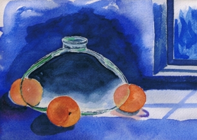
Feeling blue
This didn’t go according to plan, and I am disappointed with the result. In fact, I was debating whether I should post this at all. I was doing a step-by-step exercise from a book, followed all the steps, but my painting did not come out anywhere as nice as the one in the book. My main problem, as I see it, is perspective and shadows, he didn’t address that in the book, and I just added the shadows without much thought. Note to self – never add anything without much thought, you’ll live to regret it. I also think that my brushwork really sucks here and my color is dead.
On a positive side I learned what is takes to go really dark, attempted to paint glass for the first time and tried tube color – Holbein’s Indigo – my instructor shared hers. (Tube colors are something else! I am thinking about putting half a dozen tubes on my Christmas list.)


