Posts Tagged: painting
A bird for my dad
This is a common flicker. It is a small and unpretentious bird with a funny “mustache” and a simple and very chipper song. I wanted have something simple and chipper to greet my dad when he came home from a hospital where he had a little surgery. Something that would make him smile. They say that positive mood is as effective and helpful for recovery as proper medication. So, here’s a little flicker, dad! Hurry up and get well!
6″x8″ (15 x 20 cm) on Fabriano Artistico 300 gsm Soft Press, Cotman pan colors.
Another interesting thing about this painting is the new paper. I tried Fabriano Soft Press for the first time, and I believe myself to be in love. I found my favorite paper! The texture of this paper is somewhere in the middle between Hot Press and Cold Press, retaining the best of both worlds, in my opinion. It is smooth almost like HP and at the same time allows for great color flow, hard crusty edges are not a problem, pigment does not sink into paper valleys, and it is easy to lift color. A real pleasure to paint on. I will do my next portrait on it, should be great for skin.
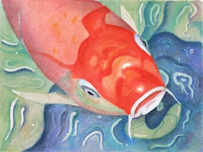
Oh Jonah he lived in de whale
And while it ain’t necessarily so, and this is not a whale but a giant red carp, I still had way too much fun painting it and singing along with Sportin’ Life while doing it.
9”x6” (22×17 cm) on Arches HP, Cotman pan colors.
In other art news, I “met” a wonderful watercolor artist Leslie White of LesliePaints. Unfortunately I only met her in blogosphere, not in person. But she is close enough, the next state over, perhaps one day… In the meantime, enjoy her colors and the way she works light in her paintings. I especially like her nudes.
Never fear!
It is finished. It took a month, dozens of glazes, and I have given up (and resumed) twice in the process.
I’ve been using a traditional glazing technique under instruction of my teacher. There were three hues used – Cobalt Blue, Alizarin Crimson and Cadmium Yellow – single color glazes. I am not sure anymore how many glazes it took, I’ve lost count after 15, the total is probably as many as 25 in some places and as little as 2 in others.
The painting looked amazingly ugly until the very end. And this is why I have given up on it two times. I just didn’t have the heart to continue and be faced with my inadequacy. Interestingly I have been reading Art & Fear: Observations on the Perils (and Rewards) of Artmaking by David Bayles and Ted Orland while I was struggling with the glazes. I think this book is a must-read for every artist, it gives an insight what the fears are about. And while it doesn’t give a cure from the fear, it leaves you with a conscious choice of how to face it.
In the end I chose to persevere. I really wanted to know if I have what it takes. The other thing that kept me going was that I soft of knew that the ugly color splotches must gel into something coherent at some point (and everybody was saying so as well). I wanted to reach that point and see for myself. It happened in the evening of Dec. 9th. I painted the pupils and while they were drying was working on the background. And then I saw it – something happened to the painting, some threshold got reached after all this time, – there was skin where moments before I could only see color splotches. It was an amazing thing to experience. In honor of that moment and the book that helped me along I call this painting “Never fear!”
On a technical note, my teacher had me do several studies for this painting. I am posting them as well, my daughter aptly called them my “little monsters”: a graphite study, a brush drawing and 2 monochromatic value studies.
Quite a ride this was. While this work is rather wobbly and unsure, there are a couple things I am pleased with – I managed the likeness, expression and correct age.
5.5″ x 5.5″ (13 x 13 cm) on Arches CP, Cotman pans colors (these are my dad’s watercolors. It pleases me to no end that I am painting with my dad’s pigments!)
Feeling blue

Feeling blue
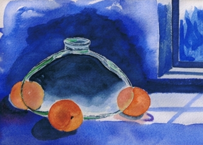
This didn’t go according to plan, and I am disappointed with the result. In fact, I was debating whether I should post this at all. I was doing a step-by-step exercise from a book, followed all the steps, but my painting did not come out anywhere as nice as the one in the book. My main problem, as I see it, is perspective and shadows, he didn’t address that in the book, and I just added the shadows without much thought. Note to self – never add anything without much thought, you’ll live to regret it. I also think that my brushwork really sucks here and my color is dead.
On a positive side I learned what is takes to go really dark, attempted to paint glass for the first time and tried tube color – Holbein’s Indigo – my instructor shared hers. (Tube colors are something else! I am thinking about putting half a dozen tubes on my Christmas list.)
Red Hat
According to my theory of predictable beginner subjects my next painting was supposed to be a building of some kind. No rule exists without exceptions, and so I created an exception. It is a human subject, and wearing a red hat at that.
The idea was to have color study exercise, a fast and sloppy wet-in-wet. It was really dripping. All reds in my box are here, mixed into cools and warms. The sketch and preparing washes took about an hour. The painting – 20 minutes.
Watercolor homework
I started working with an artist and teacher from the School of the Art Institute of Chicago. I am trying to introduce some sense of direction to my drawing and painting explorations. My teacher works with numerous media, but her monumental pen and ink works as well as her watercolors are particularly noteworthy. I am not taking formal classes in the Art Institute, this is too structured for me. Instead I work with Kaye in her studio where the class is very small and takes more of an open studio format. There are about half a dozen of us, all working in different media as it happens. I am the only watercolor student.
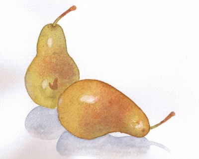
This is my first homework. The subject is inspired by wonderfully talented Jacqueline Gnott of Contemporary Realism. Initially I wanted this little painting to have some kind of a background, some painterly washes in complementary colors and so spent significant time mixing colors and making swatches in class yesterday. In the end my teacher made a suggestion that the subject is perfect and complete in its current form and only needs shadows to settle, the minimalist “incomplete” look just works. I agree.
Oh, and we ate one of the model pears for breakfast today!


