First life drawings
This week was both very exciting and very frustrating at the same time – I attempted drawing a life figure. Both drawings are long pose, one hour each. Both model were so beautiful, but I can’t say the same about my drawings – that’s the frustrating part. These are done in two separate locations, the first – in my class where the teacher invited a model for us to try in our chosen media, and the second – in Tojo Gallery.
The first drawing didn’t go well for me at all, body parts wouldn’t come coherently together in short poses. In a long pose due to my sheer determination the drawing resembles a human form. I erased the head 5 times… This was probably the most difficult undertaking in my entire (short) art life.
I realized that I cannot allow myself to give up just because it was so difficult. Just the opposite: because it was so difficult I had to do it again. I found drop-in figure drawing sessions here in Chicago and went there. It was just the same difficult, the short poses (1 min, 5 min) are a killer – it takes me just about that long to decide where to start. I did better with 10 and 15 min poses. The long one was going OK until I peeked at other easels during a break, my clumsy attempt was the worst of them. The difficult part was to push this thought out of my head and continue. I know I will become better if I persist, perhaps not brilliant, but at least proficient.
For being alive
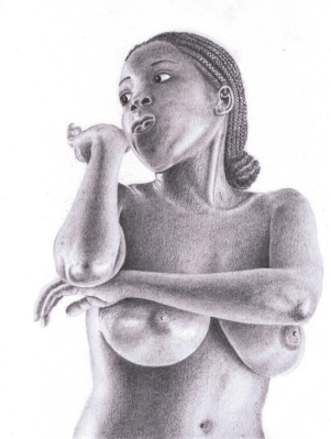
An almost first attempt at figure. After I sketched about a dozen marble statues in the Art Institute I felt brave enough to try for a finished figure drawing. This is a graphite study for a painting. I am still working on a painting, and if it will come out decent I will post it here.
A couple of words about the title. “For being alive” is a half a line from an English translation of a Russian poem by Osip Mandelstam. The poem was written in 1909.
For my guests who read Russian, here is the first stanza:
Дано мне тело – что мне делать с ним,
Таким единым и таким моим?
За радость тихую дышать и жить
Кого, скажите, мне благодарить?
And a translation by A. S. Kline:
What shall I do with this body they gave me
so much my own, so intimate with me?
For being alive, for the joy of calm breath,
tell me, who should I bless?
This is not a bad translation, better than many I come across while trying to bring my husband to the magic of Russian poetry. The mood and quiet intimacy of the original poem was nicely preserved. Unfortunately the music and the cadence of Mandelstam’s wordsmithing are lost in translation, as is the case with too many poems of that period. I guess there is no helping that.
9″ x 12″ (23 x 30 cm) graphite on paper
To love and to hold
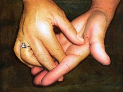
In my mind this painting of hands is a portrait, so I am putting it up with a “portrait” tag. Hands are often as expressive as faces, and sometimes even more so. While working on this painting I realized that I love painting hands and will be doing more of that.
For people who are interested in technique, this is done in glazing method and limited palette, although I used a different palette for each of the hands. As I was planning the painting and making color swatches, I couldn’t come up with a set of primary pigments that would give me the tones on both hands. Of course I ran to my teacher with my difficulty, and she pointed out that the hands have a different color temperature in the reference – one is cool and one is warm. And suddenly it made perfect sense: I used a warm primaries for the top hand and cool primaries for the bottom one. And in the end I married the two by bringing the warms to the cool hand and cools to the warm one, but in small areas, to unify them.
6.5″ x 8.5″ (16 x 22 cm) watercolor on paper
Sly III
I finished my final version of Sly. See the graphite drawing of her and the monochromatic version in the previous posts. This one was done using a limited palette of 4 colors – cadmium red, cadmium yellow, ultramarine blue and sepia. My teacher thinks I have a natural aptitude for glazing technique and had me do this portrait by painting about 50 thousand glazes of mostly water.
6″ x 6″ (15 x 15 cm) watercolor on paper
Sketches from the Art Institute
Amy is my classmate from the painting studio. Amy and I have been going to the Chicago Art Institute and drawing statues. And an odd painting. Statues are wonderful models – they keep a pose, don’t get tired and never complain! They don’t throw tantrums or hissy fits and are always on time – very professional. Amy and I have been drawing like this for the last month. I have many complaints about Chicago – weather… parking… you name it… The Art Institute is not a part of this list – it is a true blessing!
Here are results from several sessions (click on a thumbnail to see it larger):
1. A head from the Indian gallery (stone) and a figure from Early American Classics gallery (marble). I forgot to take notes whose head and figure are these.
2. Aphrodite of Knidos (marble) – a copy of a Roman 4th century statue
3. Nydia, the Blind Flower Girl of Pompeii 1858 (marble)
4. Solitude of Soul, Lorado Taft, 1914 (marble) – my very first male nude.
5. Solitude of Soul, Lorado Taft, 1914 (marble) – female. I am just wondering why is this composition called “Solitude” if there are four figures in it?… I’ve sketched two so far.
6. The Lute Player, Gentileschi, 1612-1620 (oil). I got tired and skipped the actual lute… oh well… fabric folds and drapery were hard enough. We really wanted to sketch from Caravaggio’s Supper at Emmaus, I hoped to do that foreshortened arm. But the painting wasn’t in the Caravaggio’s gallery, must have gone back to London, it was on loan here. The Lute Player was there in its place, so we did that.
I am getting better at it, and faster as well. Practice seems to be the key. As usual.
Graphite in my sketchbook.
Psychedelic flower – Take 2
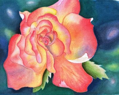
Another take on a pink rose, or Psychedelic flower, as my friend Sam Harrison aptly named it. This time the painting is on Ampersand Aquabord Museum Series Panel, a new painting surface I’ve been trying. Now that the painting is finished I can say that Aquabord with its pebbly clay surface will very likely become my support of choice.
Aquabord takes watercolor like nothing else I tried. It doesn’t bend or buckle, does not need stretching or post-painting straightening. The clay allows for gazillion washes, clearly shows where it is wet so you can’t skip a spot when painting with water, dries to brilliant white or color, and allows lifting and changes of mind with no difficulty. It behaves very much like a Cold Press paper less qualities that I don’t like. It is archival, acid-free and non-yellowing. I understand that it is possible to spray/fix a painting on Aquabord with Krylon finishing spray and frame it without glass. Even better – Ampersand makes Aquabord in a form of a cradle, so work can be displayed without a frame altogether provided sides are finished professionally.
To be objective there were two things I liked less than others. One was that when I wet the clay surface before applying a wash it darkens like wet sand, which makes it somewhat of a guess game what the resulting color will be when it dries. But I soon learned to guess with a great degree of accuracy. And two – it takes more pigment. More pigment than paper that is, but not as much for me to go broke buying more. With this said, in my mind there are not enough negatives to overcome the positives of this beautiful surface. And – No, I do not work for Ampersand!
8″x10″ (20×25 cm) watercolor on Aquabord
Sunshine blog award
 I received a blog award – Sunshine blog award. I never received a blog award before. Not one, but two people gave me this award nearly simultaneously – Leslie White of Lesliepaints and Ryan of Asmalltowndad. Two people thought that I am doing something worthwhile here, brighten their day in some small way. I am grateful and honored. Thank you, Leslie and Ryan!
Now following this award rules I am nominating 12 bloggers who helped me on my journey, taught me things and continue to brighten my life.
- Jana Bouc – a wonderfully talented artist, I started my blog modeling it on hers.
- Christy DeKoning – an accomplished watercolor artist, who watches my watercolor adventures and leaves wonderfully helpful comments and suggestions.
- Roz Stendahl – an amazingly productive multimedia artist from whom I learn, and learn, and learn.
- Sam Harrison – a young artist who was an inspiration and a catalyst that started me on portraiture. I never in my wildest dreams imagined that I am capable of drawing or painting a portrait. I thought that for decades. Now because of Sam I know that I was wrong.
- Rob Carey – Once in a while you run across a person who seems closer to the Divine than the rest of us. Rob is such person. And a wonderful artist too.
- Pete Scully – an Urban Sketchers correspondent, who helped me with recommendations, links and books when I truly didn’t know what I was doing.
- Barbara Weeks – a Chicago artist who invited me to her Sketch group.
- Casey Toussaint – who is a wonderful artist and a great supporter of my art endeavors.
- Doris Joa – just because her art is a delight.
- Sheona Hamilton Grant – one of my favorite graphite artists.
- Ramesh Jhawar – for his wonderful watercolors. I always wait for his new ones.
- Gigi Sanchez – a wonderful writer and blogger with an amazing sense of humor. Go to her site and read her stories, especially Day at the Pound.
- Joseph Tomlinson of Joseph’s Art. Now, I don’t know Joe closely, but I get an impression he is not a kind of guy who plays Blog Awards games – sorry Joe! But his sketches touch me and leave a long lasting impression.
Ok, I can count to 12, I know I got thirteen. But there is no way to exclude anyone from this nomination list. 13 it is.
And finally, special and unnumbered, this award goes to my husband, also a blogger, who deserves all awards in the world. Being married to an artist isn’t easy!
Now, my dear friends, if you accept your nomination, please do the following:
- Put the logo on your blog.
- Pass the award to 12 bloggers.
- Link the nominees within your post.
- Let the nominees know they have received the award by commenting on their blogs.
- Share the admiration and link to the person from whom you received this award.
Washing a flower
I have been practicing washes in watercolor. I drew a generic flower freehand, so I didn’t have to be concerned with things like anatomical correctness, likeness or too much perspective. The idea was to make two or three washes of different hues meet with a smooth transition at a line or curve of my choosing. Each petal as an individual pool of washes.
I couldn’t do it. My washes were all over the place. I can do a single wash and control it enough for it to end where and how I want. Then when it is dry I can put a second wash of a different hue over it or next to it and control it enough to do the transition. But not two wet washes simultaneously. More practice is needed.
My painting teacher liked this little watercolor, a dear heart that she is, and encouraged me to finish it. I am glad I did because in the process I learned how to deepen my hues with Sepia. Here it is. I am off to practice more washes.
7” x 9” (18 x 24 cm) watercolor on paper
Geb
Geb was the Egyptian god of the Earth and a member of the Ennead of Heliopolis. The name was pronounced as Geb from the Greek period onward or as Keb. He was the husband of Nut – the Sky, and fathered 4 children with her – Osiris, Set, Isis and Nephthys. As deity, he became associated with the habitable land of Egypt, it’s cultivation and harvest. (More on Geb in Wikipedia).
I imagine if Geb had ever taken a form of a man, he might have looked like this. Isn’t mythology great?!
In reality the story is much more prosaic. As told by a fellow artist from WetCanvas, the man worked as a guard at the temple complex of Karnak, Egypt. He was one of those guards who, when no one is looking, would show you all the places no one else will show you (of course!) and then ask for money, and that’s when you realize you’ve been had. This man was better than others though, he did not blatantly ask for money and agreed to pose for photos. He is now known around the world as many have drawn and painted him for the wonderful worn face full of character.
I’ve been working on this portrait since November 2009. Had to pause for a time to teach myself negative drawing – I couldn’t get the white beard/stubble right by any other method. Then I waited for Hi-Polymer 0.3mm graphite leads to arrive, because my regular 2mm lead pencils were too fat and too shiny for the task. This is the third version of the beard, not counting numerous trials in my sketchbook. As it sometimes happens to me, I was afraid this drawing would go unfinished because my skills were not up to this challenge. It looks like I was wrong.
7.5” x 9” (19 x 23 cm) Graphite on Bristol Smooth 300 Series.


