Posts in Category: watercolor
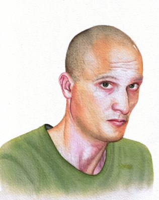
Eric
Eric is a friend of ours. He is also a proprietor of Space Time Tanks, a center for floatation, massage and several other relaxation and self-exploration offerings. New Age is alive and well, at least on 2526 Lincoln Avenue in Chicago. If you haven’t experienced a sensory deprivation tank, you owe it to yourself to try “a vacation in an hour” – you will be a new person without the trials, tribulations and expense of far away travels.
I tried several new things with this portrait. I have resisted stretching paper for a very long time thinking it was not worth the trouble. I was wrong. Stretched with gum tape over Gator board my paper allowed me to use as much water as I wished without warping and buckling and presenting me with a washboard surface just as I am about to work in fine details.
I tried a variegated background. For that I masked the face and hair with Frisket film, sealed it with masking fluid, and went free flying with large brushes, puddles of water, and swirling colors. Loved the freedom of it.
I also tried a different technique for hair, flooding it section by section with my highlight color, then working shadows with my shadow color, then putting in my main color. When all of this was dry I added details, individual hairs and then worked cool and warm tones as the last touch.
I tried to do folds and draping on his black shirt, but this didn’t work all too well. The shirt came out too flat for my liking. I have to think about my fabric draping some more.
8.5” x 11” (21 x 28 cm) watercolor on paper
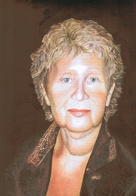
Happy Birthday to my Mom!
Today is my mom’s birthday. Or so we think… We are not a truly dysfunctional family, but we do have our share of quirks. One of them is not knowing for sure on what day my mom was born. All available documentation states February 18th. My grandma, my mom’s mother, insisted that it happened on February 15, and the heck with the records. And she ought to know, she was a major participant in the event. As a result we celebrate twice, and my mother gets twice congratulations, twice phone calls, twice as many cards and flowers, and almost twice as many presents. Personally I think it is a wonderful deal.
Many of my friends and visitors shared with me that they like little snippets of stories that go with my portraits. As I was painting I was trying to think what to write about my mom and finally realized that no matter what I write it would be inadequate. How do you put half a century of love into a blog post? This requires writing on Leo Tolstoy level to do it justice. How do you choose which story of connectedness, care, or mind reading to share? There are too many and they all are special.
Along the same lines this portrait comes short in really showing how beautiful my mom is. I tried…, and I will have to try again.
But what this portrait can do is say – Happy Birthday!
And – I love you, mom!
And – I will see you in two weeks, I can’t wait!
12” x 8.5” (30 x 21.5 cm) watercolor on paper
A big Thank-you goes to my friend Ryan of A Small Town Dad blog for his help with the dark and rich background. I always struggled with achieving a deep saturated background in watercolor. Ryan shared his technique with me without which this sweet chocolate wouldn’t have happened.
Tim, color study
I am painting again, or trying to… After my 5 months graphite marathon, a.k.a. The Sketchbook Project, I forgot how to paint. This is my second watercolor study of Tim (click the link to see the graphite portrait of him). The first painting study of him was a disaster and I am not posting it. But it is all good and valuable, I am slowly remembering how to handle glazes, a little dry brush, handling and mixing colors. It goes very slowly, I feel as if I am struggling with my hues and values, forcing the media to do what I see in my mind’s eye. This is very different from the free and fluid feeling I had with graphite. By the end of the Sketchbook Project I was simply using the media to render what I wanted, not trying to subdue it into compliance. But I now know about practice, diligence and patience, and what results can be achieved with that. This after all is only the first of a new series I have in mind.
7″x9″ (18 x 23 cm) watercolor on paper
People watching in Metropolis
There is a lot of art activity on this front, but I am not sure any of the results are worth posting. I have two portraits in the works, one in graphite and one in watercolor. The graphite may be finished soon… ish… and may get to be posted then. The watercolor one is in early stages, and it is too soon to tell whether anything worthwhile will come out of this.
I have gone to a life-drawing session again and am still wondering if I should post my charcoal attempts. I don’t particularly like them although the model was absolutely great. I am also studying anatomy, specifically drawing/constructing hands working from Burne Hogarth’s book Drawing Dynamic Hands.
To keep up with the blog amidst all this activity here are two sketches from Metropolis café which is next to my gym. There’s wonderful people watching in Metropolis, and I indulge in it while trying to catch my breath after working out or waiting for my daughter.
Watercolor, graphite, sketchbook
Happiness
What is happiness? No-no, I am not going to digress into a philosophical discussion here, this is a prerogative of my dear husband who can address this question properly in his blog Empathy in the Context of Philosophy and do it justice. (This of course is a shameless plug – check it out if you dare :D!)
Reality is simple: happiness is a terrific haircut! Not in Paris, not even in cosmopolitan and fashionable Tel Aviv, but here in backwater Netanya, not even in its French populated downtown, but in the sleeping district Daniel Ayache, the winner of multiple L’Oreal competitions, makes magic with his comb and scissors. Here’s the proof – my lovely daughter stepping out of his salon, laughing into the tropical sun with pure delight. That’s happiness! And amazingly happiness wasn’t even that expensive!
Jerusalem watch
In the city where trouble is always just a blink away military security is visibly present. Leaving Zion mountain in the Old City we ran into this group of security patrol. Boys and a girl with large automatic weapons were walking in the direction of King David’s Tomb. This is what normal life looks like here. I took some pictures. One day there will be peace. This day hasn’t come yet.
For being alive – in color
For being alive is now complete in watercolor. I am somewhat disappointed with the end result – I did not succeed in creating a sense of aliveness to the extent I imagined and planned. But I learned a lot in the process, so I am calling it a study. It is done in limited palette (pyrrol red, red oxide, ultramarine, cobalt blue, new gamboge and sepia). During a critique session in class I realized that my composition crop is working against the image, my background is not strong enough to bring forth my idea, and skin colors lost their variety of blues and violets somewhere in the process. On a positive side I am pleased with the 3D effect I was able to achieve, her expression and the lines of her body.
10″ x 14″ (25 x 36 cm) watercolor on paper
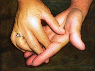
To love and to hold
In my mind this painting of hands is a portrait, so I am putting it up with a “portrait” tag. Hands are often as expressive as faces, and sometimes even more so. While working on this painting I realized that I love painting hands and will be doing more of that.
For people who are interested in technique, this is done in glazing method and limited palette, although I used a different palette for each of the hands. As I was planning the painting and making color swatches, I couldn’t come up with a set of primary pigments that would give me the tones on both hands. Of course I ran to my teacher with my difficulty, and she pointed out that the hands have a different color temperature in the reference – one is cool and one is warm. And suddenly it made perfect sense: I used a warm primaries for the top hand and cool primaries for the bottom one. And in the end I married the two by bringing the warms to the cool hand and cools to the warm one, but in small areas, to unify them.
6.5″ x 8.5″ (16 x 22 cm) watercolor on paper
Sly III
I finished my final version of Sly. See the graphite drawing of her and the monochromatic version in the previous posts. This one was done using a limited palette of 4 colors – cadmium red, cadmium yellow, ultramarine blue and sepia. My teacher thinks I have a natural aptitude for glazing technique and had me do this portrait by painting about 50 thousand glazes of mostly water.
6″ x 6″ (15 x 15 cm) watercolor on paper


